
はじめに
前回は BoxLayout を使用して Button を様々な方法で配置する方法を説明しました。

今回は、FloatLayout と、その他の Widget について説明していきます。
前提条件
前提条件は以下の通りです。
- Python がインストールされている
- Windows11 (Ubuntuでも可?)
- Kivy[full] がインストールされている
Kivy のレイアウトについて
レイアウトの詳細な説明についてはこちらの公式サイトにあります。
レイアウトには、以下の種類があります。
- BoxLayout … Widget を隣接するように配置していきます。size_hint で幅・高さを調整できます。
- Grid Layout … Widget を格子状に配置していきます。rows, cols を使用して格子サイズを設定できます。
- Float Layout … Widget をレイアウトサイズに対して相対的・絶対的に位置指定して配置します。
- Stack Layout … Widget を隣接するように配置していきますが、スケーリングされず、絶対サイズで配置されます。
- Anchor Layout … Widget の位置を left や bottom で決定する単純なレイアウト。size_hint は使用不可。
簡単な UX Widget について
- Label
- Button
- CheckBox
- Image
- Slider
- Progress Bar
- Text Input
- Toggle Button
- Switch
- Video
が、あります。
Widget の紹介
先に、ベースプログラムを載せておきます。前回からの続きです。
from kivy.app import App
from kivy.uix.widget import Widget

from kivy.uix.boxlayout import BoxLayout
from kivy.uix.button import Button

from kivy.lang.builder import Builder
Builder.load_file('test_2.kv')

class MyWidget(BoxLayout):
    pass

class MyApp(App):
    def build(self):
        return MyWidget()

if __name__ == '__main__':
    MyApp().run()
<MyWidget>:
orientation:'vertical'
size_hint_y: 0.5
size_hint_x: 0.5
Button:
text: 'my first button'
Button:
text: 'this is Button'Label
kv ファイルのみ変更していきます。
まずはラベルと、文字サイズを大きくする font_size を変更していきます。
<MyWidget>:
    orientation:'vertical'
    size_hint_y: 0.5
    size_hint_x: 0.5
    Button:
        text: 'my first button'
    Label:
        text: 'this is label'
        font_size: 30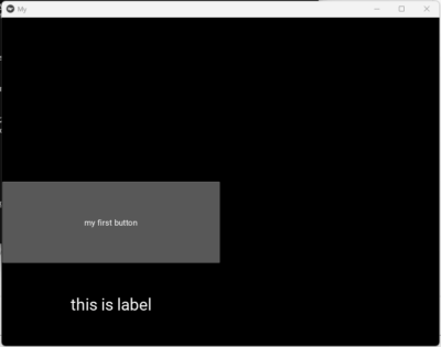
CheckBox
続いて、チェックボックスを配置していきます。
BoxLayout で、ラベルとチェックボックスを配置します。
<MyWidget>:
    orientation:'vertical'
    size_hint_y: 0.5
    size_hint_x: 0.5
    Button:
        text: 'my first button'
    BoxLayout:
        orientation:"horizontal"
        Label:
            text:"checkbox"
        CheckBox:
            group: "a"
        CheckBox:
            group: "a"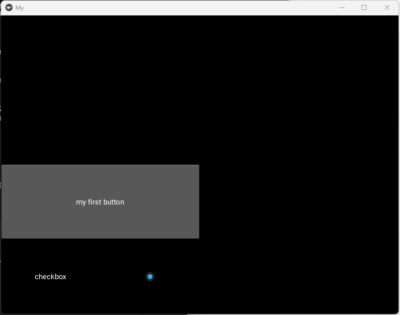
チェックボックスが配置されました。group を設定すると、その group 内で一つしかチェックを入れることができません。
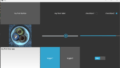
Image
Image は、画像を表示することができます。
同じフォルダ内に、test_2.png を配置しておきます。
<MyWidget>:
    orientation:'vertical'
    size_hint_y: 0.5
    size_hint_x: 0.5
    Button:
        text: 'my first button'
    Image:
        source: "test_2.png"
        size: self.texture_size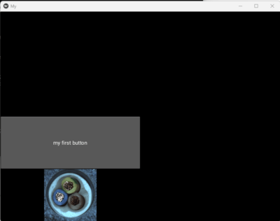
Slider
スライダーを配置します。
<MyWidget>:
    orientation:'vertical'
    size_hint_y: 1
    size_hint_x: 1
    Button:
        text: 'my first button'
    Slider:
        min: 0
        max: 100
        step: 1
        orientation: 'vertical'
    Slider:
        min: 0
        max: 100
        step: 1
        orientation: 'horizontal'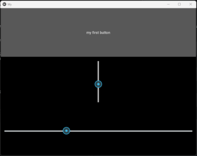
Progress Bar
進捗バーを表示します。
<MyWidget>:
    orientation:'vertical'
    size_hint_y: 1
    size_hint_x: 1
    Button:
        text: 'my first button'
    ProgressBar:
        max: 100
        value: 50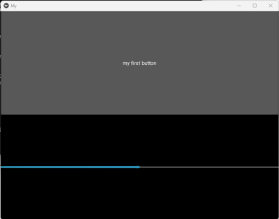
value を変更することで値の管理をすることができます。
Text Input
テキスト入力ボックスを作成します。
<MyWidget>:
    orientation:'vertical'
    size_hint_y: 1
    size_hint_x: 1
    Button:
        text: 'my first button'
    TextInput:
        text: "TextInput1"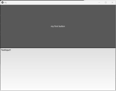
Toggle Button
トグルボタンを配置します。
<MyWidget>:
    orientation:'vertical'
    size_hint_y: 1
    size_hint_x: 1
    Button:
        text: 'my first button'
    ToggleButton:
        text:'text1'
        group: "a"
    ToggleButton:
        text:'text2'
        group: "a"
        state: "down"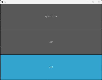
クリックを繰り返すと ON / OFF の様子が確認できると思います。
Switch
スイッチを配置していきます。
<MyWidget>:
    orientation:'vertical'
    size_hint_y: 1
    size_hint_x: 1
    Button:
        text: 'my first button'
    Switch:
        active: True
    Switch:
        active: False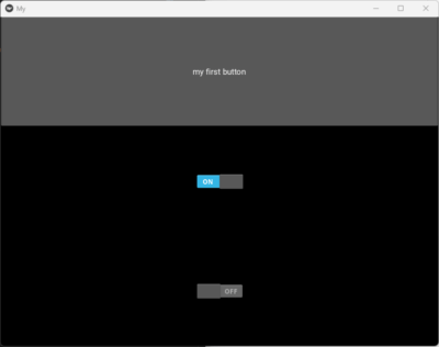
おわりに
今回は各種 Widget の使用方法について説明しました。
次回はすべて配置して、状態や入力値を取得する方法について説明します。

コメント